
Design begins with a line, a light pencil, and a quiet surface. As an architecture mentor, I watch students translate intuition into legible form by sketching on grids. The discipline of drawing on graph paper helps you test relationships between space, proportion, and light before committing to a computer model.
Whether you’re drafting a quick concept or laying out a schematic, the way you choose and use grid paper sets a pace for your project. For many students and professionals, a dependable reference is standard graph paper, a tool that remains useful from early sketches to clean, scalable diagrams.
Grid basics
In practical terms, graph paper, grid paper, and coordinate grids all describe the same idea from slightly different angles: a repeating pattern of squares that helps you measure and align without constantly rechecking with a ruler. A square grid is easiest for beginners because it preserves right angles and regular spacing, which you’ll rely on for block outlines, furniture layouts, and grid-based diagrams.
The key is consistency—keep your lines light, your pen pressure steady, and your scale clearly labeled at the edge so future readers can follow your logic.
A guide for beginners starts with two decisions: grid spacing and paper size. Common spacing on Letter-size or A4 sheets is 1/4 inch (about 6 mm) for quick concept sketches, with 1/8 inch (3 mm) used for more detailed work. If you’re working in metric, a 5 mm or 10 mm grid is natural. The paper size matters because it determines how much you can sketch before zooming in or cropping. In practice, many students alternate between Letter or Tabloid (11×17) for larger layouts and smaller, portable sheets for site observations. Align the grid to the paper’s margins, and note the chosen scale near the edge so it travels with every page.
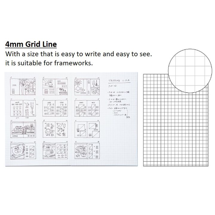

The most common error is picking a grid that’s too fine or too coarse for the task. A tight grid slows layout iteration and makes it hard to keep proportions accurate, while a sparse grid can blur alignment cues. Solution: start with a moderate spacing (1/4 inch or 5–10 mm) for general layouts, and switch to a finer grid only for detailed elements like interior elevations or furniture plans. Mark the grid spacing and scale on the page to avoid confusion later.
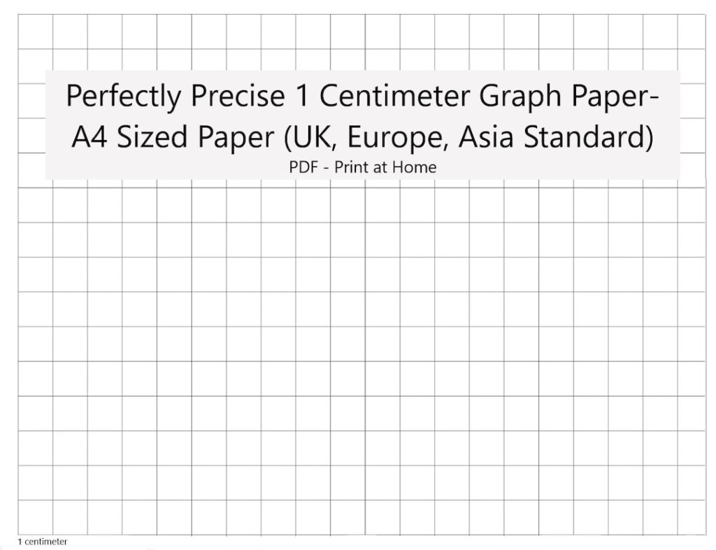
Many beginners forget to consider margins, crop marks, or the actual printable area of their sheet. If a line runs into the edge or printing trims the grid unevenly, measurements become unreliable. Solution: set consistent margins, estimate the bleed area if you’ll scan, and keep critical lines at least a small distance from the edge. This habit prevents lost information during reproduction or digitization.