
I’m a printable designer who loves tiny, practical moments, and today I kept thinking about how printable fancy letter stencils quietly shape my everyday projects. They aren’t magic, but they smooth rough edges on makeshift signs, menu boards, and gift tags that my desk helper hands out with a proud grin.
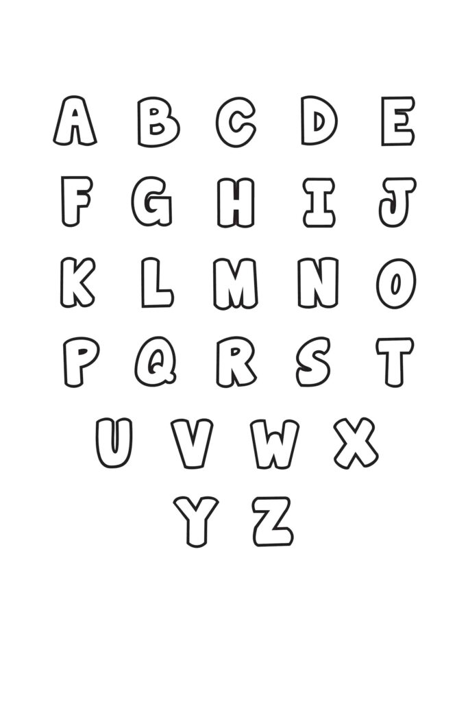
Last week I was chalking up a last-minute classroom fundraiser, needing neat name tags for a student-led bake sale. We printed a simple sheet and used a few flourishes from a set I keep nearby on the desk, so the kids could feel ownership of their design. The stencil helped us keep letters consistent without forcing anyone to master calligraphy in a single afternoon, and it saved us from scrambling for someone to hand-letter everything at the last minute.
What they actually do
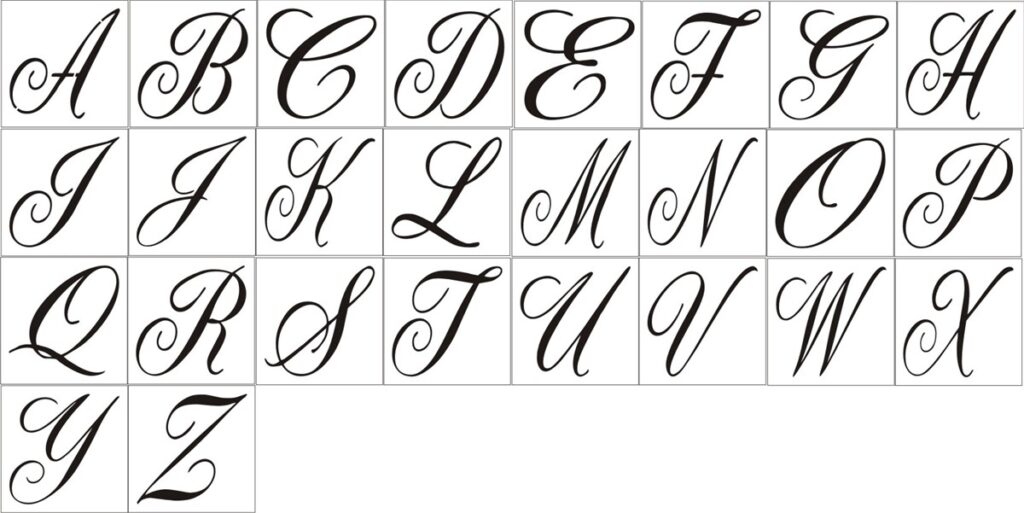
In practice, these tools shine on smooth, clean surfaces, but they aren’t miracle workers on rough or glossy textures. I take a quick test swipe with a scrap sheet first, then adjust pressure and alignment. I’ve learned to expect slight variability in ink density and occasional mis-strokes on the first pass. A second pass often tidies up the edges, but it can smear if you rush.
For my routine, they’re most useful for small, decorative touches rather than bold headlines. They’re approachable for beginners, but I still remind students that spacing matters and that a steady hand helps. If you’re printing at home, a light acrylic shortpad and a steady desk surface make a big difference. If I’m using colored pencils or water-based ink, I test on a disposable label first and watch for feathering.
That means porous materials like unsealed cork or newspaper can behave unpredictably, so I avoid them for pieces meant to last.
Practical setup and tips
When I actually pull them out, I start with a clean, flat surface and a little masking tape to hold the stencil edges. A soft pencil or graphite transfer helps me mark the baseline before dipping into ink or paint. On paper, the result is clean; on fabric, you need a fixer or heat setting. On wood tags or painted surfaces, the grain or texture can throw off your alignment and you’ll need to recheck edges.
Sometimes I ’ll also tape a thin layer of masking tape beneath the stencil to catch any stray bleed when I work on fabric or wood.
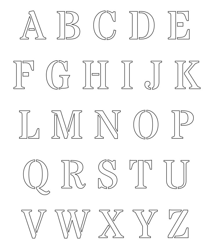
Fonts vary in how they cut, and some letters need extra care—like tall lowercase ascenders or wide strokes that skew. I keep a small set of trial markers and remind myself to cut the spacing conservatively. The payoff is a crisp edge you can reuse a few times before resharpening, especially when I’m testing several font styles on the same sheet.
I also appreciate that, with a light touch, the ink stays legible and not smudged. Finally, watch the paper weight—thin sheets curl easily, while heavier card stock holds a cleaner edge but may require more pressure.
What to expect and what to adjust
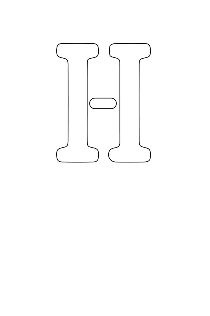
Realistically, you’ll want to manage expectations and plan for a few quick tests. Keep scrap paper handy, calibrate your pressure, and don’t expect perfection on every surface. If you want a bolder look, layer with a second pass or swap to a thicker marker. The idea is to add charm, not perfection. By documenting a couple of test outcomes, you’ll build a tiny, repeatable workflow. I also keep a tiny grid of notes on a sticky sheet nearby to recreate the same layout later.

As a designer who keeps a drawer of ready-made templates, I’ve learned to treat these tools as helpers rather than heroes. The small, thoughtful touches they enable can save time and spark ideas, but I still rely on patience, practice, and a steady hand. These little tools remind me that design is a dialogue with the moment. For my next project, I’ll choose a simple layout, test on scraps, and keep expectations realistic with printable fancy letter stencils in mind.